


Beyond the Mouse LAB 6: MATLAB Plotting Data
October 3, 5
Instructor: Jeff Freymueller
x7286 Elvey 413B jfreymueller@alaska.eduTA: Shanshan Li
Last Updated: September 30, 2017
Due: Tuesday Oct 10, before class
Lab slides
none.
Exercise 1:
Download these two files and store them in the same directory:
- temperature data for the last 30 years at station Fairbanks Int'l Airport
- a script which creates a basic plot
Execute the script such that the figure appears on your screen. It looks a little weird with spikes; like
a random fence. They are there because our x values are actually caldendar dates coded as yyyymmdd.
We'll take care of that later. For now, I want you to discover the properties of the figure/axes
you can change with the property editor: in the figure window menu go to 'edit'->'axes properties' and/or
'figure properties'. Try to find a button that says 'More Properties'; change things and see what happens.
Take note of the respective names of the properties; they are similar to what you would use as parameters
in get/set. Also try adding a title, and labels for x and y axis. There's nothing to turn in, just keep
in mind that basically every figure property you can change in the Figure Editor can be changed from the command
line/ your scripts. For example, if you want to get the y axis limits (smallest and largest) values of y,
the property name is 'YLim'. You can get the values using:
ylimits = get(gca, 'YLim');
The function gca returns a handle to the current plotting axis, so you can use it whenever
you want to get a property of the current axis.
After you have played with the properties for a while, you can make a function that will
generate a plot with your chosen properties. In the figure window, choose
File->Generate Code... to create a file with a function that will generate
your plot, given a set of X and Y values. Save this to a .m file and turn in that file.
Exercise 2:
In this exercise you will start with the simple plotting code given in the example and make a new script that will make a much nicer plot. The exercise is mostly cookbook, just follow the instructions. The parts you will have to figure out are mostly things like converting strings to numbers and vice versa.
Now we're getting a little more serious; the display of the data as shown in the figure is wrong, i.e. does not correspond to the
actual timeseries in the file! We' have to correct for this and also make things look nicer. If you check line 5 in
fai_temp.m you will see that I plot temps over dates where dates is a vector
that holds the dates of temperature measurements in the format 'YYYYMMDD' (check FAI_temps.txt if you don't believe me). Matlab does not know
anything about the semantics of the dates vector for the x-axis and assumes dates contains
integer values. This is where the weird spaces in your figure come from: we have big gaps
from 1980-12-31 to 1981-01-01, i.e. 19801231...19810101, and 19811231 - 19820101, and so on. By default plot
connects all data points with a line, which makes it look like the gaps contain real data. Now everybody thinks there's data where you have none.
This becomes clear when you replace line 5 in fai_temp.m with: plot(dates, temps, '.').
Now you can see that the gaps are really gaps. OK. Change it back!
Matlab's internal representation of times is using serial date numbers.
Instead of using dates as given in the original file, let's do this:
- convert
datesfrom integer representation into strings usingnum2str - now convert the resulting string array into serial date numbers using
datenum, using the formatting string 'yyyymmdd'. Thedatenumfunction expects a string as input, which is why we needed to turn the integer into a string. Save the output of datenum to a variabled_nums - Now, instead of calling
plot(dates, temps); replacedateswith the serial date numbersd_numsyou just calculated. You should get a nice sinusoidal temperature series.
You might notice that the tick labels are in strange places. Let's try having them every 5th year. There are many ways of doing this. For the most generic one we only need to know that the date format is 'yyyymmdd.' To get tick marks in the style '1985 - 1990 - 1995 ... ' without actually knowing upper and lower bounds of the time series, we can do this (we treat the yyyymmdd dates as actual numbers here):
- Use
minondates, to find minumum of the timeseries - Divide this minimum by 100,000 and round down using
floor. - Multiply the 'floored' value by 10 and you have the lower decadal bound.
- Do the same to find the upper decadal bound, but use
maxandceilinstead ofminandfloor - You have the upper and lower bounds of your date tick vector; create an array that increases in steps of 5
- Convert this vector to Matlab datenums like you've already done above. Adjust the date formatting string to that of four digit years, though!
- Now, call
set(gca, 'XTick', ticks)to set your tickmarks on the x-axis to the dates you desired. (replace the variabletickswith the name of the variable you used to store the vector mentioned above). - Note that 'out of bounds' tickmarks aren't placed - that's a result of the
axis tight
Alright. Now YOU know that your x-axis tick spacing is 5 years, but it's not really obvious in the figure as the datenumber labels haven't been converted to a reasonable string yet. We should change the tick labels!
- call
setjust like above, but this time change the property'XTickLabel'to the result of callingdatestron the serial date number arrayticksyou create above. - Your labels should appear in the format: '01-Jan-1985' ... '01-Jan-2010'. You can change this format
by either giving one of the format numbers from 1-31 as second parameter for
datestrOR giving a freeform format similar to'yyyy-mm-dd'. Seedatestrdocumentation for details. Play with different formats and find one you like.
Now that we know what we're dealing with we can add title, x, and y labels. I recommend you
use '\circF' as part of your ylabel argument to clarify that temperatures are in degrees Fahrenheit (we know that
from experience - the numbers in the file certainly aren't degrees Celcius, they remain undocumented though).
- In your
title,xlabel,ylabelcalls, set the 'FontSize' to 12 - In your
titlecall, also set the 'FontWeight' to 'bold'
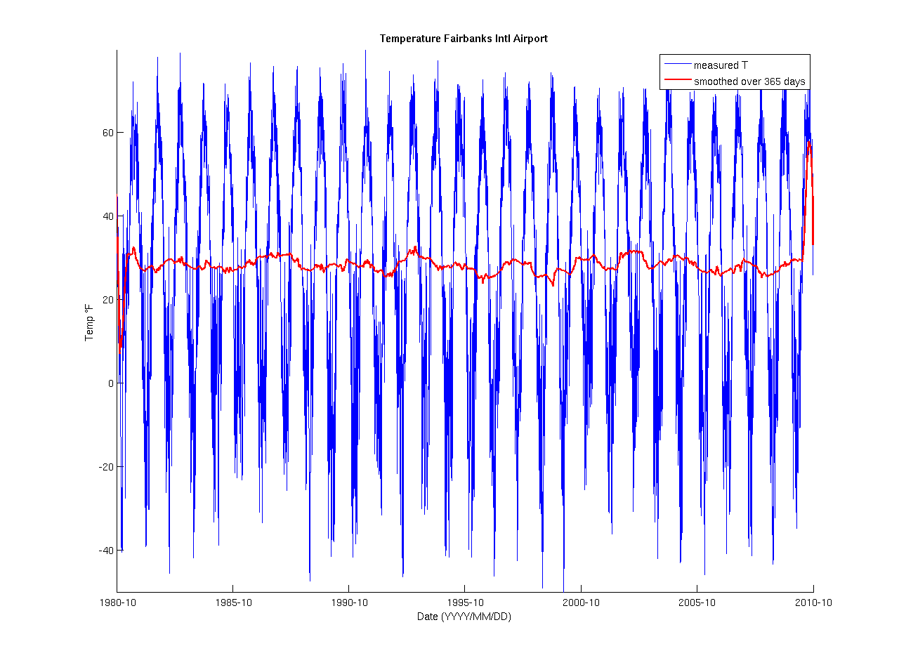
If you want to get a better idea about how the temperature evolved over this long time, you could smooth it using a moving average approach over a period of 365 days:
- apply the
smoothfunction which is part of the Curve Fitting Toolbox totempsand give the respectivespanto 365. - I plotted the result in red with a 'LineWidth' 2 over
d_nums - Don't forget to switch
hold on - You may want to add a
legend
Your final figure should look similar to this:
Exercise 3: Setting axes
Now, with very few steps you can add a lot of extra information to that figure. Let's add a spectrogram. Here's what I want you to do:
- save the above script under a new name, say
fai_spec.m - just prior to the first
plotcommand, add anaxescall in which you set the position property to something reasonable. Make the height of the axes not larger than 30% of the figure. I positioned my axes 10% from the left border, 65% from the bottom, made it 89% wide and 30% high - the percentages are in relation to the figure dimensions. - Now go to the bottom of your script (i.e., the very end) and create another axes; keep the height below 50% of the figure. I left 10% of the figure width as space between left figure and axes edges as well as 10% of the figure height from the bottom of the figure to the bottom of the axes. Width is again 89% and height is 50%.
- Now plot the spectrogram:
spectrogram(temps, 180, 90, 128, 1/(24*60*60), 'yaxis'). Briefly explain what the arguments of this command mean (it's sometimes very useful to look at timeseries this way). - Pretty simple, no?
- Now save your plot to a file for easy viewing.
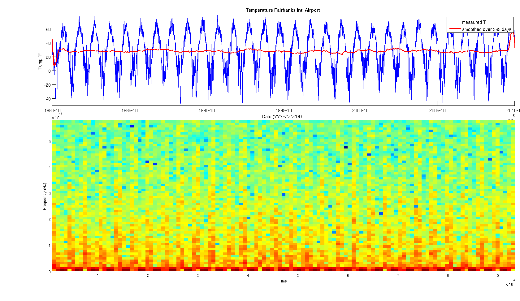
Turn in your plot, final script and all needed files, and your explanation of what the input
arguments for spectrogram mean.
Helpful Matlab Functions:
Here is a list that might be of help.
- axes Properties
axesceildatenum: Convert a string into a serial date numberdatestr: Convert a serival date number into a formatted date stringfloormaxminset,getgraphics' handle propertiesxlabel,ylabel,titlespectrogram: Have a spectrogram plottedsmooth: moving average
Dr. Jeffrey T. Freymueller
Professor of Geophysics
Geophysical Institute
University of Alaska, Fairbanks
Fairbanks, AK 99775-7320